Top Interior Color Trends for 2023
December 14, 2022
It’s no secret that the COVID-19 pandemic slowed the pace of life. For a while, it affected interior color palettes, causing homeowners to lean into light and airy shades. However, now that most of us are getting back to living life on our own terms without mandates or restrictions in place, interior color palettes are reflecting the desire to move forward. Read on to learn which color palettes will be “it” for 2023 and how they emphasize the connection between home and self.
Biome Palette
This color palette represents a renewed interest in the restorative nature of the outdoors. It contains soothing natural tones along with darker ones, reflecting that matters are still intense in the world. Let’s take a closer look at some of the shades the Biome palette includes:
- Urban Bronze – Inspired by the beautiful brown shades of the 1970s, this shade was voted color of the year for 2021. It plays well with darker cabinet colors and alongside metallic shades of sinks, silverware, and kitchen appliances.
- Evergreen Fog – This soft gray-green color is 2022’s color of the year. It’s among the nature- and wellness-minded hues currently surging in popularity.
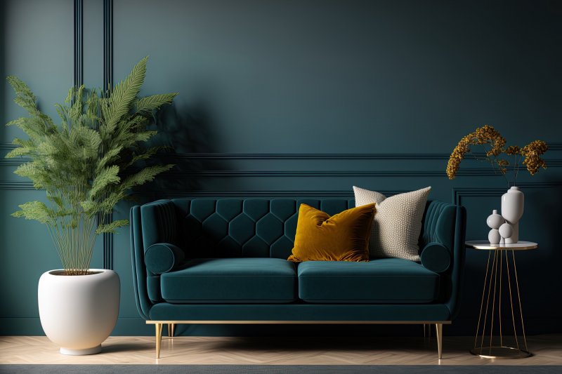
- Mount Etna – A rich blue-green color that fits well alongside light or blonde wood-toned cabinets.
Lore Palette
Unlike the Biome palette, the Lore palette reflects a reverence of artisanal traditional with colors like:
- Toile Red – This ruby red color works well in almost any room, making your home look fiery and passionate.
- Wallflower – If you want a mauvy color that is amethyst-like, Wallflower is one that exudes notions of joy and optimism.
- Blue Peacock – This deep turquoise-y color is incredibly eye-catching, adding color and life to any room.
- Serape – This golden shade will make quite the impression on your home. It adds balance to a room while providing more than what meets the eye.
Nexus Palette
This selection of colors creates a serene palette that evokes the warm tones of a canyon sunset. Here are a few shades you can find in the Nexus palette:
- Lei Flower – A beautiful soft and peachy color that will add life and vibrance to your home.
- Malted Milk – This light color offers hushed elegance. It’s a neutral peachy orange with a brown undertone.
- Kestrel White – You can create a snug, conversation-starting space with this bright warm white that contains a subtle pink undertone.
Origin Palette
You can let your imagination run wild with the Origin palette! These color options will surely make your home look vibrant and stunning:
- Indigo – A rich worldly blue shade, this color offers an elevated twist on the primary color. Its appeal stretches back through centuries!
- Peppery – This orange paint color will look great in any home, adding vibrance and energy.
- Kale Green – This gorgeous green color plays well with trendy design elements like rounded silhouettes, stone-slab tables, and sculptural armchairs.
About Platinum Painting of Fort Worth
At Platinum Painting of Fort Worth, we strongly believe your interior surfaces should actually reflect your desired mood, personality, and preferences. If you want to give your home a makeover for the new year, we’re prepared to help. To get started on your interior painting project and get a free quote, visit our website or call our office today.
No Comments
No comments yet.
RSS feed for comments on this post.
Sorry, the comment form is closed at this time.